
PitchScope MLB Pitcher Performance Analytics Platform
Skills
Class
Resources
About the Project
Project Overview
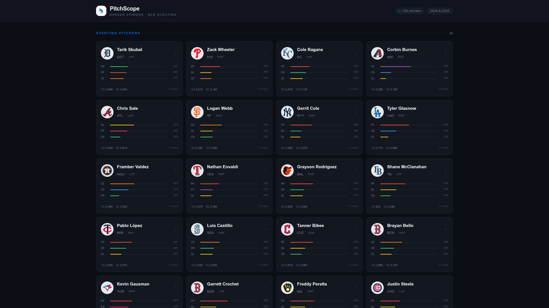
PitchScope is an interactive analytics platform designed to evaluate and compare MLB pitcher performance through structured data visualization and performance metrics. Rather than presenting raw statistics in isolation, the platform organizes them into a coherent framework that makes performance patterns immediately legible to anyone reviewing them, from casual fans to analysts making real evaluations.
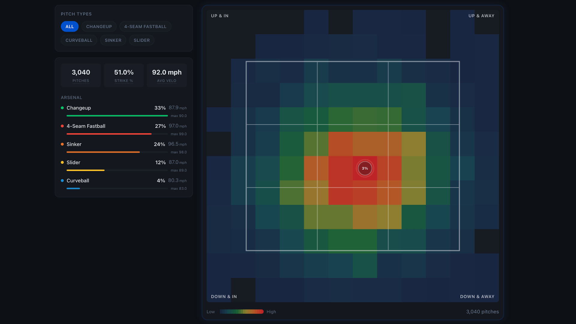
The platform presents pitcher performance data through organized dashboards and visual summaries, enabling users to explore trends, evaluate consistency, and compare athletes across key metrics. Each dashboard is structured around a clear metric hierarchy, so a user can move from a high-level view of a pitcher's season down into the specific numbers driving that impression, without losing context along the way. Comparison tools sit alongside individual profiles, letting users benchmark pitchers against each other rather than reviewing each in a vacuum.
Built using Lovable for rapid front-end development, the project emphasizes clarity, structured metric hierarchy, and intuitive interaction design to support analytical decision making. Every design decision, from how metrics are grouped to how comparisons are surfaced, was made with the same goal in mind: reduce the distance between a raw statistic and a usable insight. The result is a platform that treats data visualization not as decoration on top of the numbers, but as the actual interface for understanding them.
The Issue
Raw MLB pitching statistics are dense and difficult to interpret without structured visual context, making it challenging for analysts and fans to quickly evaluate and compare pitcher performance. A single pitcher's profile can span dozens of individual metrics, spin rate, velocity trends, pitch mix, situational splits, and without a clear framework for organizing them, the meaningful signals get buried in the noise. Fans are left scrolling through spreadsheets that were never designed to answer the actual question they're asking: is this pitcher actually good, and how do they compare to their peers.
The objective was to transform raw pitching statistics into a clear, interactive experience that supports deeper performance analysis and comparison across key metrics. That meant more than just prettier charts, it meant rethinking how the data should be grouped and sequenced so a user could move from a general impression down to specific evidence without getting lost. The goal was an experience where evaluating a pitcher's consistency, or comparing two athletes side by side, felt like a natural next step rather than a research project of its own.
Key Objectives
Design the platform architecture and metric framework for pitcher performance analysis.
Structure statistical data to support comparative and trend-based insight.
Build an interactive web experience with intuitive navigation and clean data.
Organize performance indicators into clear visual groupings for usability.
Enable users to explore trends, evaluate consistency, and compare athletes across metrics.
Create a scalable analytics platform that balances interactivity with clarity.
My Role & Impact
Platform Architecture
Designed the platform architecture and metric framework for pitcher performance analysis, establishing a structured hierarchy that could scale as new metrics and comparison types were added.
Data Structuring
Structured statistical data to support comparative and trend-based insights, organizing raw statistics into formats built for querying, filtering, and cross-pitcher comparison rather than flat, one-off lookups.
Front-End Development
Designed the platform architecture and metric framework for pitcher performance analysis, establishing a structured hierarchy that could scale as new metrics and comparison types were added.
UX Design
Organized performance indicators into clear visual groupings and focused on intuitive navigation, so a user could move from a high-level read on a pitcher down into supporting detail without losing their place.
The Process
- Identified key MLB pitching performance metrics and established a structured hierarchy, prioritizing the stats that actually drive comparison and evaluation over raw data dumps rather than treating every available number as equally important. The goal wasn't completeness, it was relevance, surfacing the handful of metrics that actually predict whether a pitcher is performing well and deprioritizing the ones that just added noise.
- Designed the platform architecture to support comparative analysis and trend exploration, structuring raw statistical data into organized, queryable formats so the interface could pull from and display it cleanly, without forcing every dashboard load to reprocess the underlying numbers from scratch. That meant deciding upfront how data would be grouped and related, so comparisons across pitchers could happen instantly instead of being computed on the fly each time.
- Built interactive dashboards and visual summaries using Lovable for rapid front-end development, iterating quickly on layout and functionality to move from concept to working product without a long build cycle, testing each interaction pattern against real pitcher data as it came together. Fast iteration mattered here specifically because the right way to display a metric often wasn't obvious until it was actually populated with real numbers and viewed in context.
- Organized performance indicators into clear visual groupings and refined navigation and interaction design, so related metrics stayed together and users could move through the platform without hunting for context. The refinement process focused on reducing the number of clicks or scrolls between a user's question and the data that actually answered it.
The Solution
Delivered an interactive MLB pitcher performance analytics platform that transforms dense statistical data into clear, structured dashboards supporting comparative analysis and trend exploration. What started as a way to make raw pitching stats more legible became a working demonstration of how thoughtful information architecture can turn a wall of numbers into something an analyst, a scout, or a casual fan can actually reason with, without needing a background in sabermetrics to find the signal in the data.
The project strengthened applied data visualization and performance analytics skills, demonstrating the ability to design scalable analytics platforms that balance interactivity with clarity, capabilities directly applicable to data-driven roles in sports analytics, business intelligence, and performance optimization. More broadly, it reinforced a pattern that shows up across my other work too: the hardest part of a data project is rarely the data itself, it's deciding how that data should be organized so the people using it can find the answer without having to think like an analyst first. That's the same instinct behind the dashboards I built for dstribute.io and the governance frameworks I've applied in policy research, structure the information so the insight is obvious, not buried.
Common Questions
Frequently Asked Questions
An interactive dashboard that turns raw MLB pitching stats into something you can actually compare, evaluate, and act on.