
dstribute.io Job Distribution Analytics Platform
Skills
Collaborators
Class
About the Project
Project Overview
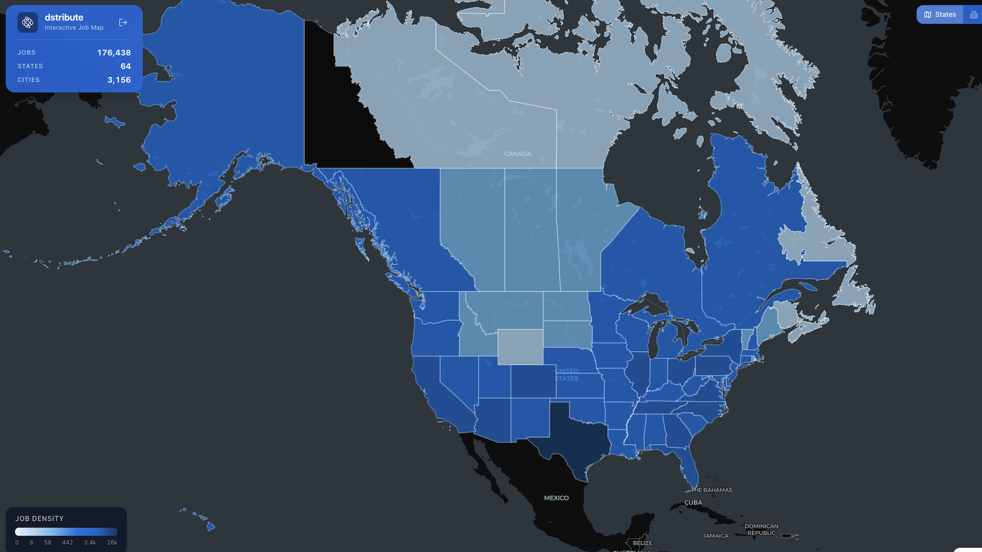
As part of my Communicative Visualization for INFO course, I designed and built an interactive job distribution analytics platform for dstribute.io, bridging academic coursework with my role as Business Operations Manager. The platform presents job distribution data through an interactive map interface, giving dstribute.io clients a clear view of where jobs are being distributed and how they perform geographically, turning what used to live in spreadsheets and reports into something a client could actually read at a glance.
The coursework's central question, how do you make complex data legible to someone without a technical background, mapped almost exactly onto a real problem the business already had. Rather than treating the class project as a hypothetical exercise, I built it against dstribute.io's actual distribution data from the start, which meant the design constraints were real ones: what a client would actually need to see, not just what would demonstrate a visualization technique well.
Built using Lovable, Version 1 was completed between January and April 2026 and continued to develop further as part of my ongoing responsibilities at dstribute.io. The project didn't end when the coursework did, it became a live tool in active use, which meant every design decision had to hold up under real client scrutiny, not just academic evaluation. That distinction shaped the whole build, a chart that looks good in a classroom presentation isn't automatically one that helps a client make a real decision about where to invest their distribution budget.
The Issue
Job distribution performance data is inherently geographic and comparative, where jobs are going, how they're performing by market and channel, but that kind of insight is hard to communicate through tables or reports alone. A spreadsheet can tell you the numbers, but it can't show you the pattern, and pattern recognition is exactly what a client actually needs to make a decision about where to invest their distribution budget next. Most reporting tools stop at presenting data accurately, without ever asking whether that presentation actually helps someone act on it.
Prospective clients evaluating dstribute.io needed a way to see performance at a glance, and current clients needed an ongoing view into how their distribution was actually performing across markets. Without a visual interface built for both audiences, that insight stayed buried in data that took real effort to interpret, effort that a prospective client evaluating the platform for the first time was unlikely to spend. The platform needed to earn a decision-maker's attention in seconds, not after they'd already committed to reading through a full report.
Key Objectives
Design and build a job distribution map interface using Lovable.
Structure distribution data to support clear geographic and performance-based insight.
Apply communicative visualization principles to make complex distribution data accessible to non-technical audiences.
Design the platform for two distinct audiences: prospective clients evaluating dstribute.io and current clients monitoring performance.
Bridge academic visualization coursework with a live, production-facing business tool.
Continue evolving the platform based on real client usage since its initial release.
My Role & Impact
Data Visualization
Applied communicative visualization principles from coursework directly to a production tool, making complex distribution data legible to non-technical audiences without stripping out the nuance.
Interface Design
Designed and built the interactive map interface using Lovable, translating geographic and performance data into something clients could read at a glance rather than parse from a report.
Dual-Audience Design
Structured the platform to serve two distinct users at once, prospective clients evaluating whether to sign on, and current clients tracking active performance.
Cross-Context Delivery
Bridged coursework and business responsibility directly, turning a class project into a live tool used in my role as Business Operations Manager, with real client usage as the actual test of whether the design worked.
The Process
- Began in Communicative Visualization for INFO, where the coursework's central question, how do you make complex data legible to someone without a technical background, mapped almost exactly onto a real problem at dstribute.io: clients needed to see distribution performance, not just receive it as a report. Rather than treat the assignment as hypothetical, I built it against real distribution data from the start.
- Built Version 1 in Lovable between January and April 2026, structuring the underlying distribution data around geography and performance so it could actually drive an interactive map interface. Every structural decision at this stage was about making the data queryable in the ways a client would actually want to explore it, not just displaying it correctly.
- Designed with two different users in mind at once, a prospective client sizing up the platform for the first time, and a current client checking in on live performance, which shaped what needed to be immediately visible versus available on drill-down. Those two audiences don't want the same first impression, so the interface had to earn attention quickly for one and support depth for the other.
- Continued developing the platform after the coursework concluded, as part of ongoing responsibilities at dstribute.io, refining it based on how clients actually used it rather than how it was originally scoped in the class assignment. Real usage surfaced needs the original academic framing hadn't anticipated.
The Solution
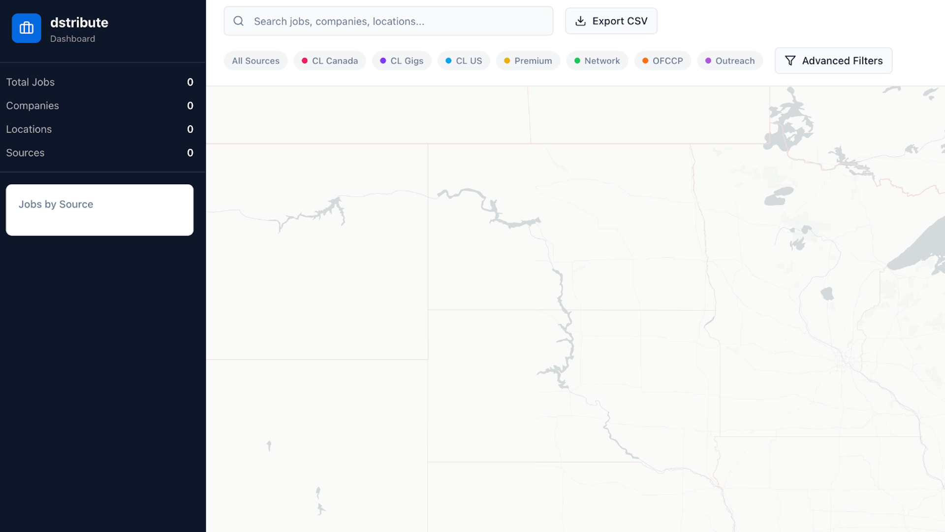
Delivered an interactive job distribution analytics platform that turns dstribute.io's distribution data into a clear, geographic, map-based view, live and in active use for both prospective and current clients. What started as coursework became a tool clients actually rely on to understand where their jobs are going and how that distribution is performing, not a one-off assignment that got shelved once the semester ended. That shift, from academic exercise to daily-use business tool, is the clearest evidence that the underlying design decisions actually held up outside the classroom, where the only feedback that matters is whether a real client can look at the map and immediately understand what it's telling them.
The project demonstrated the ability to translate classroom visualization skills directly into a product with real commercial application, and built an analytics foundation that's continued to grow alongside my responsibilities at dstribute.io. It also reinforced something that shows up across my other work: the platforms that actually get used aren't the ones with the most features, they're the ones built around how someone will actually look at them in the moment they need an answer. PitchScope and this project both started from the same instinct, take data that's technically available but practically inaccessible, and rebuild the interface around the question someone is actually trying to answer, not the dataset itself.
Common Questions
Frequently Asked Questions
A class project that became a live product as an interactive map turning dstribute.io's job distribution data into something clients can actually read.