Buffs Data Visualization Challenge: Data Design Competition
Skills
Class
Resources
About the Project
Project Overview
As part of the Communicative Visualization course in my BAM program, I was assigned a remix project requiring us to redesign our final deliverable using a completely different dataset, keeping the underlying design thinking intact while rebuilding the actual experience from the ground up. The assignment tested whether the instincts behind a working design, not just its final output, would actually transfer somewhere new, since anyone can polish one dataset once, but proving the underlying approach generalizes is a different and harder bar to clear.
Instead of the job distribution data used in my final project for dstribute.io, I worked with CU Boulder campus building information to reimagine the structure, narrative, and visual framing entirely, rather than porting over the same charts with new labels. I designed and built an interactive data visualization experience focused on communicating insight clearly and effectively, treating the remix as a genuine second design problem instead of a reskin of the first one.
The project required moving beyond technical accuracy to prioritize narrative clarity, visual hierarchy, geographic context, and user comprehension, the same underlying discipline as the dstribute project, now applied to a dataset with a completely different shape, audience question, and spatial dimension to account for. Where the original project answered a business performance question, this one answered something closer to an orientation question, and that shift changed nearly every design decision that followed.
The Issue
Campus building data is inherently complex, spanning categories, locations, sizes, and usage patterns, and is difficult to present in a way that guides users toward meaningful insight rather than just a list of facts about buildings. Presented flatly, it reads as a directory, a spreadsheet with a map bolted on as an afterthought. Presented well, it should read as a story about how a campus actually functions, where academic life concentrates, how building types cluster, and what patterns only become visible once someone can see the whole picture at once instead of scrolling through disconnected rows.
The challenge was to transform raw building data into an interactive experience that prioritizes clarity and engagement over raw technical detail, while still maintaining the analytical rigor a data visualization project needs to hold up under real scrutiny. That balance is harder than it sounds, oversimplify and the visualization becomes decorative rather than genuinely analytical, but preserve too much technical detail and it collapses right back into the directory-style presentation the entire remix was meant to move past.
Key Objectives
Design the full visualization concept, narrative structure, and user flow.
Structure campus building data to support clear analytical storytelling.
Build an interactive web-based experience using Lovable.
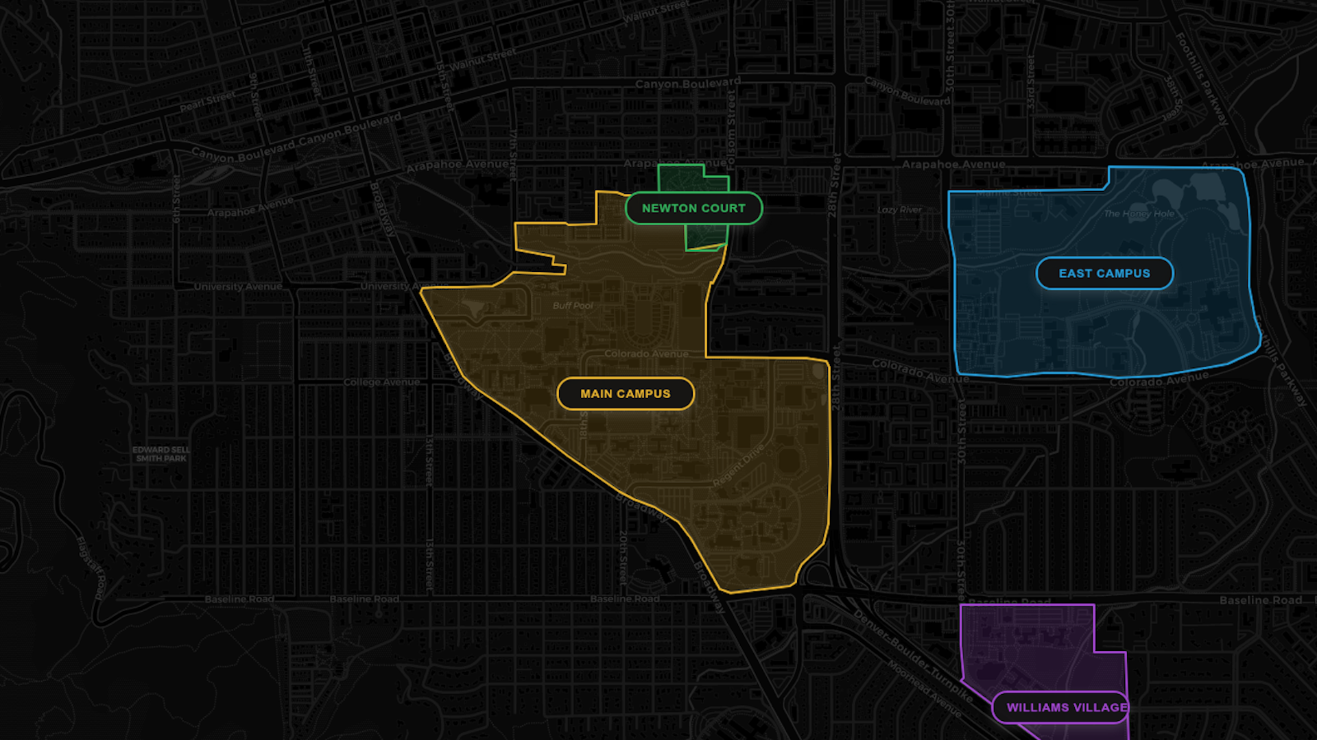
Integrate OpenStreetMap for geographic context and spatial analysis.
Reduce cognitive load while improving interpretability and clarity.
Demonstrate how intentional visualization design improves understanding and decision quality.
My Role & Impact
Visualization Design
Designed the full visualization concept, narrative structure, and user flow guiding users from context to insight, while reducing cognitive load and improving interpretability at every step.
Data Structuring
Structured and prepared campus building data to support clear analytical storytelling, rather than leaving it as a flat, browsable directory of facts, also giving the user a chance to make up their own mind about the design.
Interactive Development
Built the interactive web-based experience using Lovable for front-end development, moving from a concept to a responsive, working product in just two weeks.
Spatial Integration
Integrated OpenStreetMap to provide geographic context and spatial analysis, the piece of the project with no equivalent in the original dstribute build.
The Process
- Selected CU Boulder campus building data as the remix dataset and identified the storytelling angle early, since a remix project only works if the new dataset actually demands a different narrative, not just a reskin of the original with new labels on the same charts. Committing to a genuinely different subject, one with no obvious performance metric to fall back on, meant the storytelling question had to come first, before any design work could reasonably start.
- Structured the data to support a visual progression that guides users from context to insight, then designed the narrative flow and visualization hierarchy around prioritizing clarity over complexity, deciding what a user needed to see first before anything more detailed would actually make sense to them. That sequencing decision shaped everything downstream, since a user arriving with zero context needs a different entry point than one already familiar with the campus, and the design had to work for the former without boring the latter.
- Built the interactive front-end using Lovable with responsive, web-based components, and integrated OpenStreetMap to provide geographic context and spatial analysis, since buildings are inherently spatial in a way the original job distribution data wasn't, which pushed the build into territory the original project never had to touch. Getting the map to function as more than decoration, actually carrying part of the analytical weight rather than just illustrating where things are, took real iteration on how much interactivity to expose versus how much would just clutter the experience.
- Iterated on annotation strategy, dashboard logic, and insight sequencing to optimize comprehension, refining not just what was shown but the order it was revealed in, so the experience built understanding progressively instead of presenting everything to a user at once and hoping they'd sort it out themselves. Each round of iteration meant testing whether a first-time viewer could actually follow the story without narration, and adjusting whatever broke that flow.
The Solution
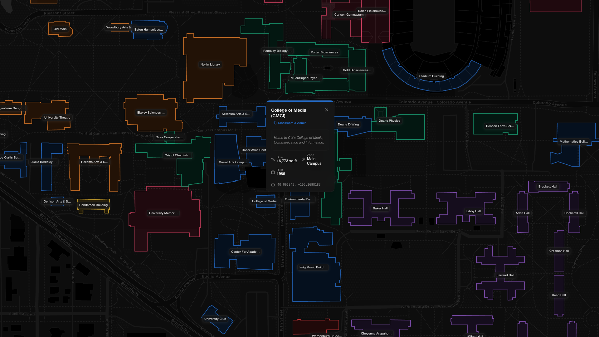
Delivered a structured visual progression that presents CU Boulder campus building data through an interactive experience demonstrating how intentional visualization design improves understanding, decision quality, and engagement, proving the same design instincts behind the dstribute project could hold up on a dataset with a completely different shape, audience, and stakes. What made this a genuine test rather than a comfortable repeat was the absence of an obvious business metric to anchor the story to, campus buildings don't have a "performance" the way job distribution does, so the narrative had to be built around orientation and discovery instead, a fundamentally different design problem wearing a familiar set of tools.
The project strengthened my ability to translate complex datasets into structured, decision-ready insight, developing stronger spatial analysis, mapping skills, dashboard logic, and annotation strategy directly applicable to performance and distribution data work, the exact skill set the original course assignment was designed to test in the first place, just proven on unfamiliar ground instead of home turf. That transferability is really the point of a remix assignment: not whether one visualization looks polished, but whether the underlying judgment behind it, what to show, in what order, and how much to simplify without losing rigor, holds up when the subject matter changes out from under it.
Common Questions
Frequently Asked Questions
A remix project that took the same design instincts behind a business analytics platform and proved they'd hold up on a completely different kind of data.